






Get a free customer journey map template for designers with customer journey image examples included—visualize user touchpoints, emotions, and pain points to craft better UX.
A customer journey map template for designers turns scattered research notes into a visual story that shows what users think, feel, and do at each stage of their interaction with a product. Instead of starting from a blank canvas, you work from a structured layout that already separates touchpoints, emotions, pain points, and opportunities, so you can spend your time on insight rather than formatting.
This guide walks through how designers use these templates in real projects, what should go into each section, and how to adapt the format for different formats like PDF exports, PowerPoint decks, and B2B sales cycles. Whether you're building your first map or refining a process your team already uses, the goal is the same: replace guesswork with a repeatable structure that makes the research visible to everyone who needs it.
What a Customer Journey Map Template Includes
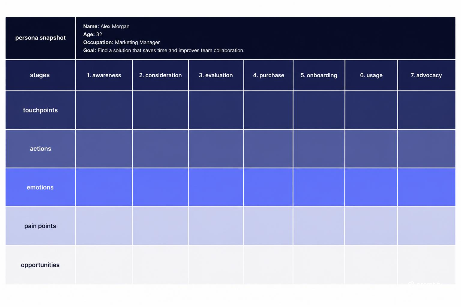
A well-structured template gives you a consistent frame for organizing research, even when the underlying data changes from project to project. The value of a template isn't that it tells you what the answers are, it's that it tells you where each piece of information belongs, so you're not reinventing the structure every time you start a new project.
- Persona snapshot: A short summary of who the journey belongs to, often pulled from existing research or a user persona template. This should include goals, context, and any constraints that shape how this person interacts with your product.
- Stages: The phases a user moves through, such as awareness, consideration, onboarding, and support. Stages should reflect real shifts in intent or behavior, not arbitrary time divisions.
- Touchpoints: Every screen, email, call, or interaction where the user engages with the product or team. This includes both digital and human-facing moments.
- Actions: What the user is actually doing at each stage, described concretely rather than in vague terms like "exploring" or "deciding."
- Emotions: How the user feels, often shown as a line graph or simple high/low markers. This layer is what separates a journey map from a basic process diagram.
- Pain points: Friction, confusion, or drop-off moments worth investigating further, ideally tied back to specific research findings.
- Opportunities: Design or product changes that could remove friction or improve the experience, even if they start as open questions rather than finished solutions.
Designers typically add a visual layer on top of this structure, since a customer journey image communicates patterns faster than a table of text ever could. A single glance at an emotion curve or a row of touchpoint icons tells stakeholders more than a paragraph of notes. This is especially true in cross-functional meetings, where not everyone has time to read dense documentation but everyone can scan a visual and immediately spot where the biggest problems are concentrated.
The structure also matters because it keeps the map honest. When every section has a defined purpose, it's harder to skip the uncomfortable parts, like admitting that a stage has no real emotional data behind it, or that a pain point hasn't actually been validated with users yet. A good template exposes these gaps instead of letting them hide inside vague language.
Why Designers Need a Dedicated Template, Not a Generic One
Marketing and product teams often build journey maps focused on conversion funnels or campaign touchpoints. Designers need something different: a map that connects directly to screens, flows, and interaction details. A marketing-oriented map might stop at "user signs up," while a design-oriented map needs to show what happens inside that signup flow, including every field, error state, and confirmation step.
A design-focused template usually links each stage to specific UI states or wireframes, so the map doubles as a reference during handoff. It also tends to include more detail on micro-interactions, such as what happens when a form fails validation or a loading state takes longer than expected, because these moments shape the emotional curve just as much as the big stages do. A user who hits an unclear error message during checkout may remember that moment more vividly than the overall purchase experience, even if the rest of the flow was smooth.
This level of detail also makes the map more useful during implementation. When engineers or other designers pick up the project later, a journey map that references actual screens and states gives them something concrete to work from, rather than a high-level narrative that requires translation before it can inform real decisions.
How This Differs From a Website User Journey Map Template
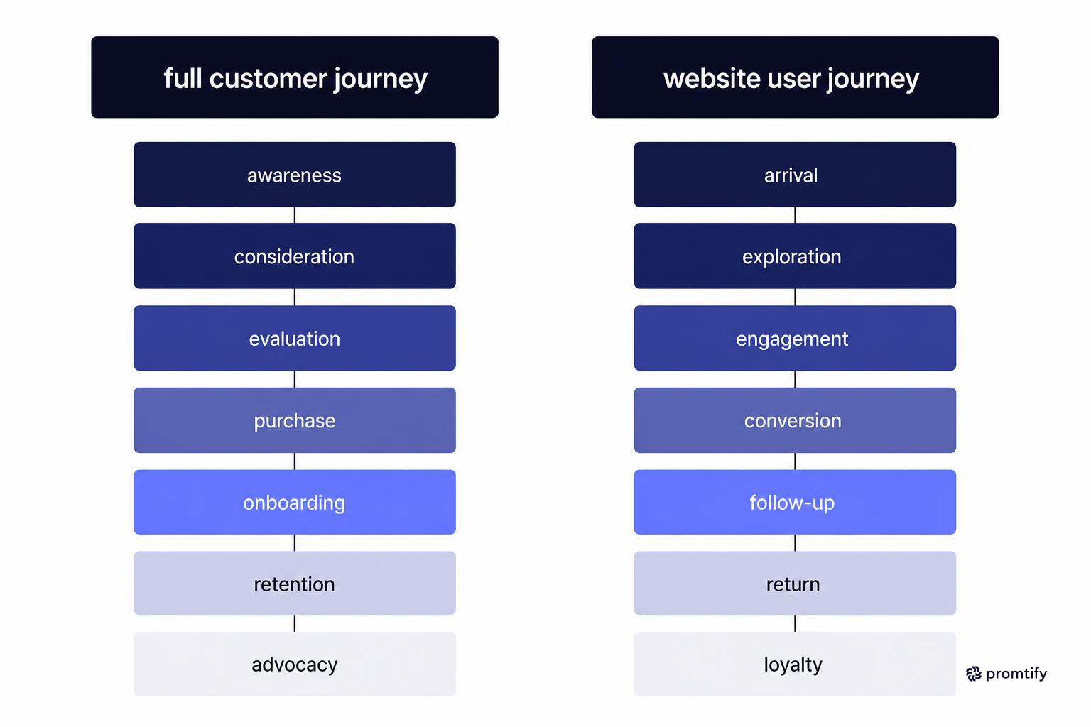
A website user journey map template usually narrows the scope to a single digital property: the steps from landing page to checkout, or from search to signup. It's a useful subset of the broader customer journey map, especially when you're redesigning a specific flow rather than mapping the full customer relationship. Because the scope is narrower, these maps can go deeper into detail, documenting every click, scroll, and decision point within that one experience.
If your project is scoped to a website redesign, start with the narrower website journey format. If you're mapping the full relationship across channels, including sales calls, support tickets, and in-app behavior, use the fuller customer journey structure instead. Trying to force a full customer journey into a website-only template usually results in missing context, since things like a sales call or a support escalation simply don't have a natural place in that structure.
It's also worth considering how these two formats can work together. A team might maintain a high-level customer journey map that shows the full relationship, with a dedicated website user journey map nested underneath it for the specific stages that happen on the product's digital properties. This layered approach keeps the big picture visible while still allowing enough detail for the team actually building the website flow.
Choosing the Right Format: PDF, PowerPoint, or Digital Canvas
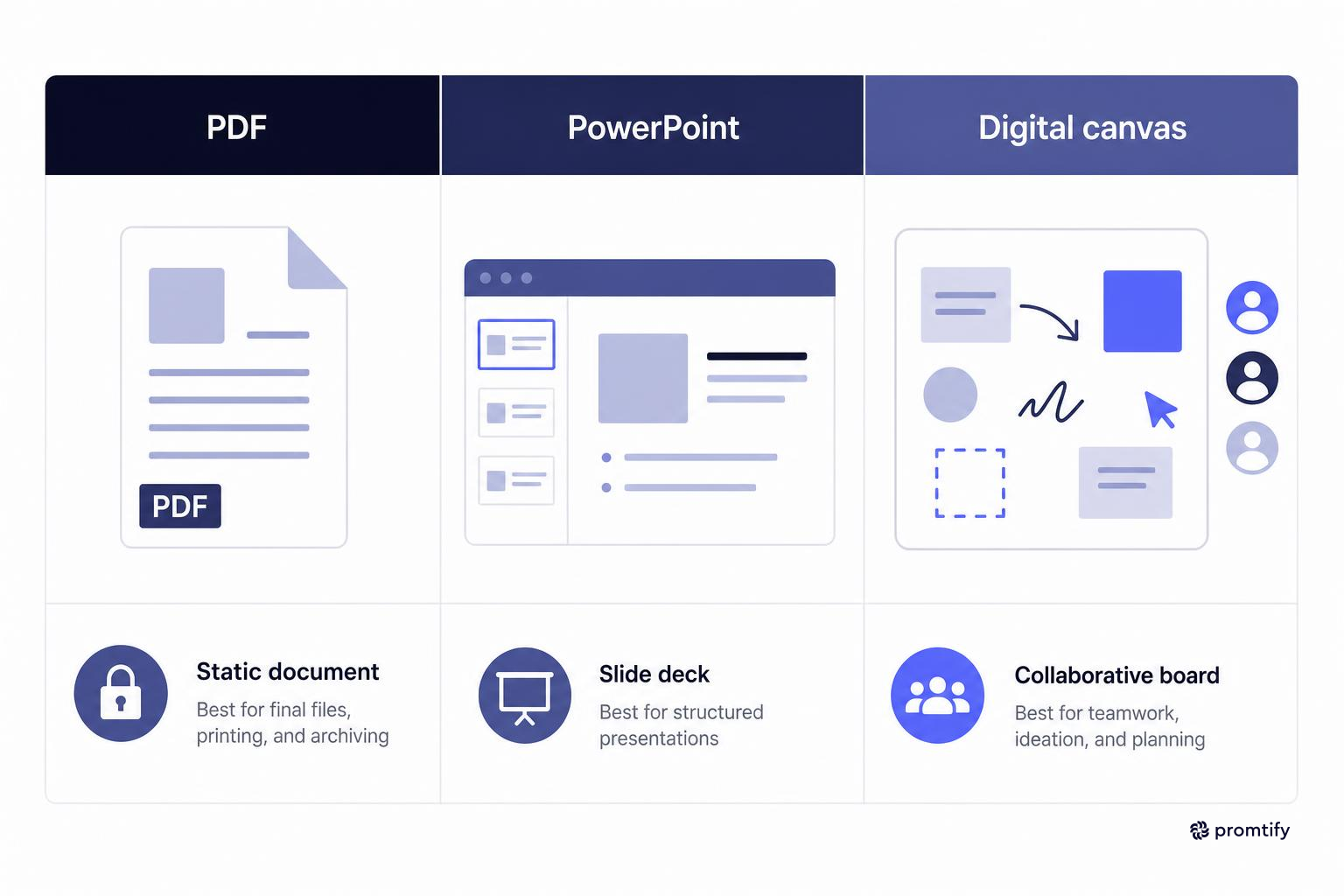
The format you choose depends on who will use the map and how often it needs to be updated. There's no universally correct choice here, the right format is the one that matches how your stakeholders will actually interact with the document.
Customer Journey Map Example PDF
A PDF version works well for sharing a finished map with stakeholders who don't need to edit it. It's static, easy to print, and renders consistently across devices, which makes it a reasonable choice for client deliverables or executive reviews. Because the layout is locked, you don't have to worry about someone opening the file on a different machine and seeing broken fonts or shifted elements.
The tradeoff is that updates require going back to the source file and re-exporting, so PDFs are best treated as a snapshot rather than a living document. If your project involves ongoing research that will change the map frequently, relying solely on PDF distribution means stakeholders may end up working from an outdated version without realizing it. A simple way to avoid this is to include a version date or revision number directly on the PDF, so anyone referencing it later knows whether they're looking at the current map or an earlier iteration.
Customer Journey Map Template PowerPoint
A customer journey map template PowerPoint file is useful when the map needs to live inside a larger presentation, such as a research readout or a quarterly design review. PowerPoint also makes it easier for non-designers on the team to make small edits without touching a design tool, which matters when a product manager or marketing lead needs to update a single stage without looping in the design team for a minor change.
The downside is that complex visual layouts, like layered emotion graphs or detailed touchpoint icons, can be harder to maintain cleanly compared to a dedicated design canvas. PowerPoint wasn't built for the kind of freeform layout that journey maps often require, so teams sometimes end up fighting with alignment and spacing rather than focusing on content. One practical workaround is to design the visual elements in a canvas tool first, then paste them into PowerPoint as locked images, keeping only the text and labels editable within the slide itself.
Digital Canvas Tools
Tools like Figma, Miro, or FigJam are often the best fit for active design work, since they support real-time collaboration and let you link directly to wireframes or prototypes. Many teams build the working version in a canvas tool, then export a PDF or PowerPoint copy for distribution once the map is finalized. This approach gives you the best of both worlds: a flexible source file for ongoing work, and a polished, shareable export for people who just need to review the findings.
Canvas tools also make it easier to keep the journey map connected to other research artifacts. You can place the map on the same board as supporting interview notes, survey summaries, or linked prototypes, so anyone reviewing the map can click through to the underlying evidence instead of taking the conclusions at face value.
Mapping a B2B Customer Journey
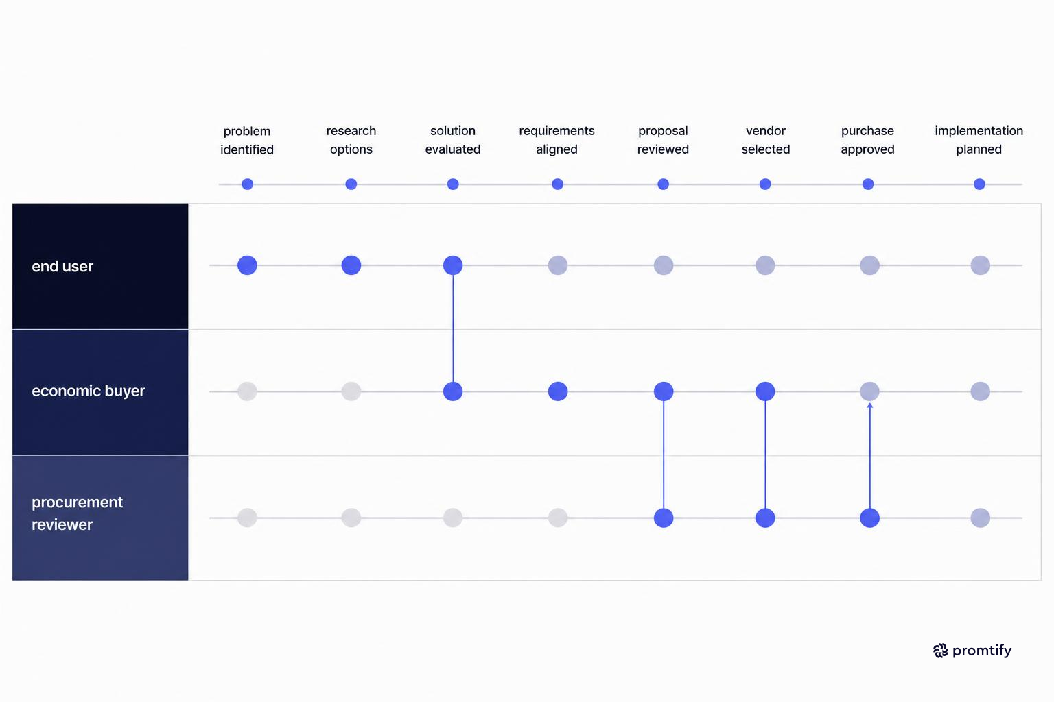
B2B customer journey map examples usually look different from consumer-facing ones because the buying process involves more people and a longer timeline. A consumer might decide to purchase a product in a single session, but a B2B buyer often needs sign-off from several people before a decision is finalized.
Instead of a single user moving through stages in days or weeks, a B2B journey often spans months and includes multiple stakeholders: an end user, a buyer, and sometimes a procurement or legal reviewer. Each of these roles may need its own swimlane within the same map, since their actions, emotions, and pain points differ even though they're moving through a shared timeline. An end user might be frustrated by a clunky trial experience, while the economic buyer's biggest concern is pricing transparency and contract terms, two very different emotional threads happening at the same point in the calendar.
- Multiple personas per journey: Map the end user's experience separately from the economic buyer's experience, even if they overlap in timing. Keeping these separate prevents one stakeholder's pain points from getting diluted or lost inside another's narrative.
- Longer consideration stages: B2B journeys often need extra stages for evaluation, procurement, and internal approval that consumer maps skip entirely. These stages can involve their own sub-processes, such as security reviews or vendor comparisons, that deserve dedicated attention in the map.
- Sales and support touchpoints: Include demo calls, proposal reviews, and contract negotiations as touchpoints, not just product screens. A poorly run demo can do as much damage to the relationship as a confusing interface, so it belongs in the same map.
- Renewal and expansion stages: B2B relationships often continue well past onboarding, so consider adding stages for renewal, upsell conversations, and account reviews. These later stages often reveal friction points that never show up during the initial sale, such as confusion over usage limits or unclear upgrade paths.
If you're designing for a B2B product, pairing the journey map with a buyer persona template helps keep the different stakeholder perspectives distinct instead of blending them into one generic user. Without this separation, it's easy to accidentally write a journey map that reflects only the loudest or most accessible stakeholder, while missing the perspective of someone like a procurement officer who rarely interacts with the product directly but still shapes the outcome of the sale.
It also helps to note where stakeholder journeys intersect. A demo call, for example, might be a touchpoint shared by both the end user and the economic buyer, even though each person walks away with a different impression. Marking these shared moments on the map makes it easier to spot where a single interaction needs to satisfy multiple audiences at once.
Gathering Input With a Customer Journey Survey
A journey map is only as accurate as the research behind it. A customer journey survey is one of the more direct ways to collect the raw material, since it asks users to describe their experience stage by stage rather than relying on assumptions. Surveys are particularly useful when you need input from a broader group of users than interviews alone would allow, since they can be distributed at scale without requiring scheduled conversations.
Effective survey questions tend to focus on specific moments rather than broad impressions. A question like "how was your experience overall" tends to produce vague, unhelpful answers, while a question anchored to a specific stage or action produces something you can actually act on.
- Stage-specific questions: Ask what the user was trying to accomplish at each stage, not just how they felt overall. For example, instead of asking how onboarding went in general, ask what they were trying to set up first and whether they found it.
- Friction prompts: Ask directly where they got stuck, confused, or considered giving up. These prompts often surface pain points that wouldn't otherwise appear until a support ticket or churn event made them visible.
- Emotional check-ins: Use a simple scale at each stage to track how satisfaction or frustration shifts over time. Even a basic one-to-five scale, repeated at each stage, gives you enough data to sketch a rough emotional curve.
- Open-ended follow-ups: Leave room for users to describe anything the structured questions missed. Some of the most useful insights come from these free-text responses, since they capture details that a fixed-choice question wouldn't anticipate.
Survey data works best when combined with other inputs like support tickets, session recordings, and direct interviews. No single source gives a complete picture, but surveys are useful for catching patterns across a larger sample size than interviews alone can cover. If a handful of interview participants mention a problem, it's worth investigating, but if a survey confirms that the same problem shows up across a much larger group, that's a stronger signal that it deserves priority in the journey map's pain points section.
Timing also matters when running a customer journey survey. Sending the survey immediately after a specific stage, such as right after onboarding completes, tends to produce more accurate and detailed responses than asking users to recall the experience weeks or months later. If your product has multiple natural checkpoints, consider triggering short, targeted surveys at each one rather than relying on a single long survey sent at the end of the relationship.
Step-by-Step: Building a Journey Map From the Template
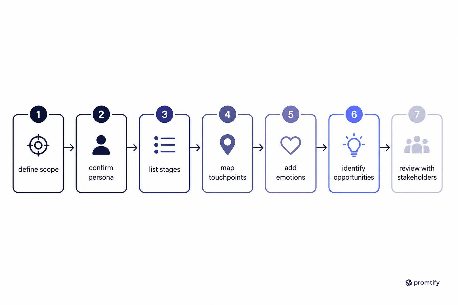
Once you have research in hand, the process of filling out the template follows a fairly consistent sequence. Treating this as a sequence rather than jumping straight to the visual layer tends to produce a more grounded, defensible map.
1. Define the Scope
Decide whether you're mapping a single flow, like onboarding, or the entire customer lifecycle. A narrower scope produces a more detailed and more useful map; an overly broad scope tends to flatten important details. It helps to write down the scope explicitly at the top of the document, so anyone reviewing the map later understands exactly what it does and doesn't cover.
2. Confirm the Persona
Attach the map to a specific persona rather than a generic "user." If you don't already have one, build it alongside the journey map using a user persona template so the two documents stay consistent. Trying to retrofit a persona after the journey map is already drafted often results in mismatches, where the stages and emotions described don't quite line up with the persona's actual goals and context.
3. List the Stages
Break the journey into stages that reflect real shifts in user intent, such as research, trial, purchase, onboarding, and ongoing use. Avoid forcing a fixed number of stages; let the actual behavior determine how many you need. Some journeys genuinely need six or seven distinct stages to capture meaningful shifts, while others can be accurately represented with just three or four. Resist the temptation to pad the map with extra stages just to make it look more thorough.
4. Map Touchpoints to Each Stage
Go stage by stage and list every touchpoint, including ones outside the product itself, like marketing emails or support interactions. This is also where linking to a user flow can help, since it connects the high-level journey to the specific screens and decision points a user navigates. Be thorough here, it's easy to list the obvious touchpoints like the main app screens while forgetting smaller ones like automated emails or in-app notifications that still shape the overall impression.
5. Add Actions, Thoughts, and Emotions
For each touchpoint, note what the user does, what they're likely thinking, and how they feel. Keep language specific and grounded in research rather than guesses. Instead of writing "user is confused," try to capture the actual source of confusion, such as "user isn't sure whether their changes were saved after clicking submit." The more specific the note, the easier it is to turn into an actionable design change later.
6. Identify Pain Points and Opportunities
Mark the moments where emotion dips or where research shows confusion or drop-off. Pair each pain point with at least one possible opportunity, even if it's just a question to investigate further rather than a finished solution. It's tempting to leave pain points without a corresponding opportunity, but even a placeholder note like "needs further usability testing" keeps the map action-oriented rather than just descriptive.
7. Review With Stakeholders
Share the draft with product, engineering, and support teams before treating it as final. Their feedback often surfaces touchpoints or edge cases that research alone missed. Support teams in particular often have visibility into recurring complaints that never made it into formal research, since users who contact support are effectively self-reporting their pain points in real time.
Visualizing the Map: Turning Data Into a Customer Journey Image
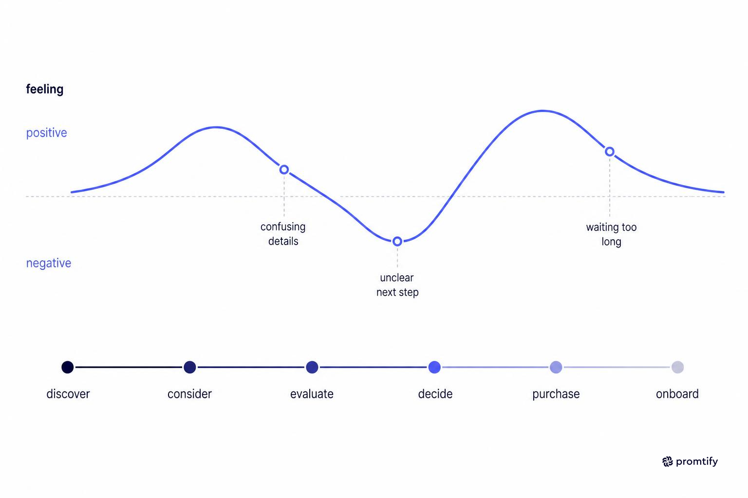
Once the content is solid, the visual layer is what makes the map usable in meetings and reviews. A clear customer journey image typically uses horizontal swimlanes for stages, a visible emotion curve, and icons or color coding to flag pain points quickly. The visual choices you make should serve the content, not the other way around, resist the urge to add decorative elements that don't carry any informational weight.
Keep the visual hierarchy simple. Stage names should be the most prominent text, touchpoints and actions secondary, and supporting notes smallest. Overly dense maps are harder to read in a meeting and often get skimmed rather than discussed in detail. If a reviewer has to squint or zoom in to understand what's happening at a given stage, the map has failed at its core job of making the research instantly legible.
If you're exporting the map as an image for a deck or document, test it at the size it will actually be viewed, since detail that looks fine on a large design canvas can become unreadable once shrunk into a slide or PDF page. A good practice is to export a test version early in the process and review it at actual presentation size, rather than waiting until the map is fully polished to discover that small text has become illegible once reduced.
Color coding deserves particular care. Using color to distinguish emotional highs and lows, or to flag specific pain points, works well as long as the palette stays consistent across the whole map. Switching color meanings halfway through, for instance using red for a pain point in one stage and then using red again for something unrelated later, undermines the visual logic you're trying to establish.
Common Mistakes When Using a Journey Map Template
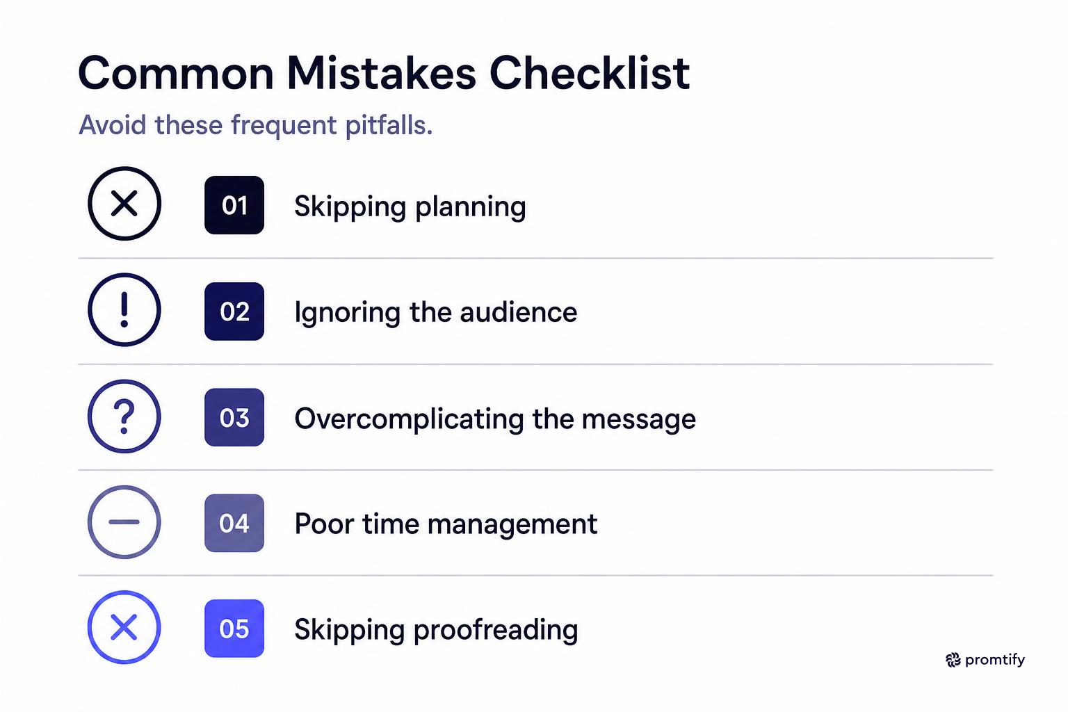
A few recurring issues show up across many journey mapping projects, regardless of the tool or template used. Recognizing these patterns early can save significant rework later in the project.
- Mapping an idealized journey instead of the real one: Templates filled in from assumptions rather than research tend to look clean but miss the actual friction users experience. A map built entirely from internal assumptions about how users "should" behave often looks polished but fails the moment it's compared against real usage data.
- Treating the map as a one-time deliverable: Journeys change as products evolve, so a map that's never revisited quickly becomes outdated. Scheduling a periodic review, even a brief one, keeps the map from silently drifting away from reality.
- Skipping the emotional layer: Without emotion data, the map becomes a flowchart rather than a journey, and it's harder to prioritize which pain points matter most. Emotional intensity is often what separates a minor inconvenience from a deal-breaking frustration, and without that layer, both can end up looking equally important on paper.
- Ignoring touchpoints outside the product: Support calls, emails, and sales conversations shape the experience just as much as the interface does. A beautifully designed app can still leave users frustrated if the surrounding communication, like confusing billing emails, undermines the overall relationship.
- Building one map for every persona: Blending multiple user types into a single journey hides differences that matter, especially in B2B contexts with multiple stakeholders. A single blended map tends to represent no one accurately, since it averages out distinct experiences into a generic middle ground.
Keeping the Map and Supporting Research Together
Journey maps rarely exist in isolation. They're usually built alongside personas, user flows, and survey data, and they need to stay connected to that context as the project moves from research to design to handoff. When these documents are scattered across different tools and folders, it becomes difficult for anyone to trace a decision in the journey map back to the research that justified it.
This is where Promtify fits into the workflow. Since journey mapping projects often involve multiple contributors over time, such as a researcher who ran the customer journey survey, a designer who built the map, and a product manager who needs the context later, Promtify lets the team save that context as a Markdown file instead of re-explaining the research and decisions each time someone picks up the project. The next designer or AI agent working on the flow can pull that saved context through MCP rather than starting from scratch.
For teams juggling multiple journey maps across different personas or product lines, this kind of shared context reduces the time spent re-establishing background before any new design work can begin. Instead of a new team member spending their first few days reconstructing why certain decisions were made, they can reference the saved context directly and get to productive work faster.
Adapting the Template for Specific Industries
While the core structure of a journey map stays consistent, the details shift depending on the industry. A template that works well for a simple consumer app may need meaningful adjustments before it fits a more regulated or complex industry.
In healthcare, for example, journeys often need extra attention to compliance touchpoints, caregiver involvement, and multi-visit timelines that don't appear in simpler consumer products. A patient's journey might involve not just their own actions but decisions made by a caregiver or family member on their behalf, and the map needs a way to represent that shared decision-making without collapsing it into a single persona. If you're working on a healthcare product, the customer journey healthcare template builds in those specific considerations, such as patient touchpoints across appointments, rather than treating healthcare like a standard retail or SaaS journey.
Similarly, B2B SaaS products often need extra stages for procurement and renewal, while e-commerce journeys tend to compress research and purchase into a much shorter window, sometimes happening within a single browsing session. Adjust the stage count and touchpoint detail to match how your specific users actually move through the process, rather than forcing every project into the same generic template. A financial services product, for instance, might need additional emphasis on trust-building touchpoints and regulatory disclosures that wouldn't be relevant in a simpler consumer context.
Connecting the Journey Map to Other Design Artifacts
A journey map works best as part of a connected set of research artifacts rather than a standalone document. Treating it as one piece of a larger research ecosystem, rather than an isolated deliverable, makes it far more useful over the life of a product.
- Personas: Ground the journey in a specific, research-backed persona rather than a generic user description, so every emotional note and pain point can be traced back to a real, well-defined individual.
- User flows: Link each stage of the journey to the actual screens and decision points a user navigates, using a user flow template for the detailed path. This connection turns the journey map from a narrative into a practical reference during implementation.
- Customer avatars: For marketing-aligned projects, a customer avatar template can help keep messaging consistent with the emotional tone captured in the journey map, so marketing copy doesn't accidentally contradict what research shows users actually feel.
- Survey data: Keep raw survey responses accessible alongside the finished map so future updates can reference the original source rather than relying on memory. When a stakeholder questions a particular pain point months later, having the original data close at hand saves time and strengthens the credibility of the map's conclusions.
Keeping these documents linked, whether through a shared folder, a design system, or a context tool, makes it easier for anyone joining the project later to understand not just what the journey map says, but why it was built that way. This kind of traceability also makes it easier to update the map confidently when new research arrives, since you can see exactly which conclusions were built on which evidence, rather than treating the entire document as a fixed, unquestionable artifact.


